Oxley Museum of Art
Main Role
Duration
Responsibilities
Project Overview
The Oxley Museum of Art (OMA) is a university-affiliated institution bridging the gap between academic research and community engagement. This project involved designing a mobile application to modernize the patron experience, streamline visit planning, and provide deep contextual engagement with the museum’s diverse collection.

Problem Statement
Museum patrons lack a centralized, mobile-friendly way to plan visits and explore the collection. Fragmented information across non-responsive platforms creates significant logistical friction for families and professionals, while a lack of on-site digital tools prevents visitors from accessing deeper artistic context or navigating the physical space efficiently.

The Goal:
Simplify the end-to-end user journey. From spontaneous pre-visit planning to immersive on-site exploration, for a diverse audience of scholars and casual visitors.
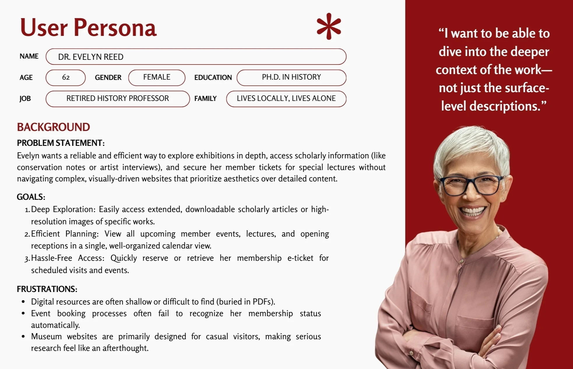
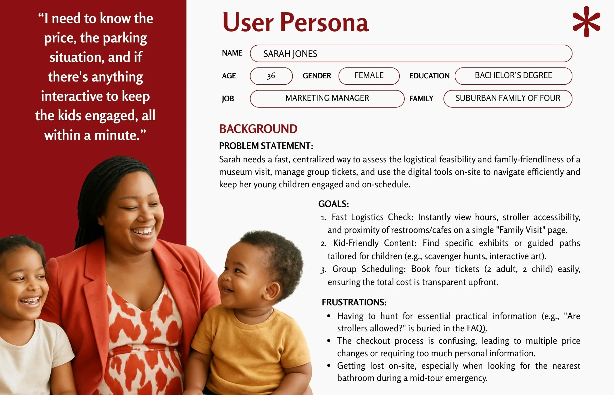
User Research: Painpoints
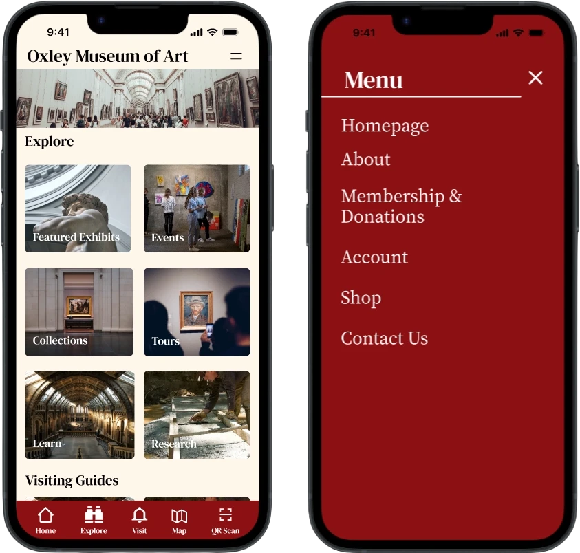
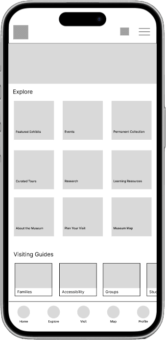
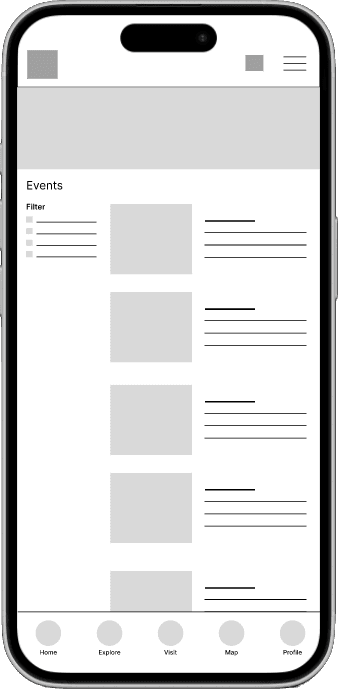
Exhibition Discovery: It's hard to find a comprehensive, up-to-date list of all current and upcoming exhibitions/events in one place. This will guide informational content and organization.
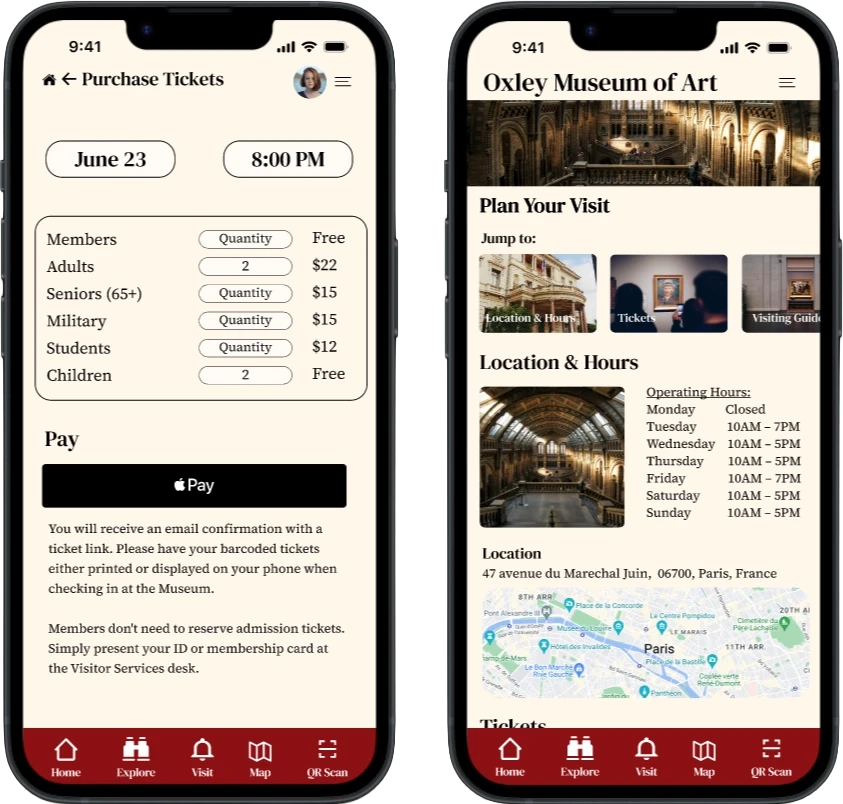
Scheduling & Tickets: Users want an easy way to buy tickets and plan visits online and then cancel or modify reservations if necessary. These abilities will be built into the new structure.
Unclear Pricing: Pricing and Membership benefits and discounts are unclear. This information will be made easy to determine and navigate to.
Art Engagement: Users want more information about pieces and wish for interactive content, audio guides, or digital resources that enhance the viewing experience
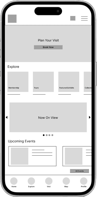
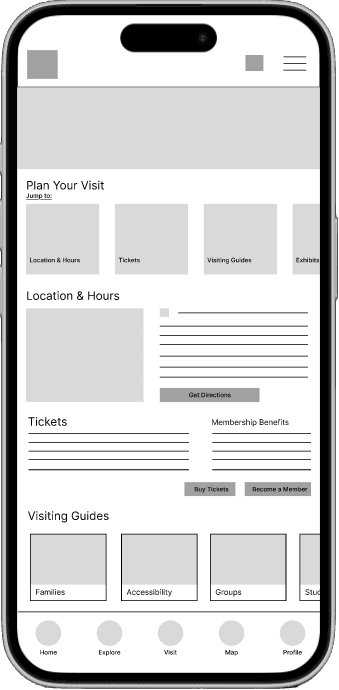
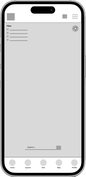
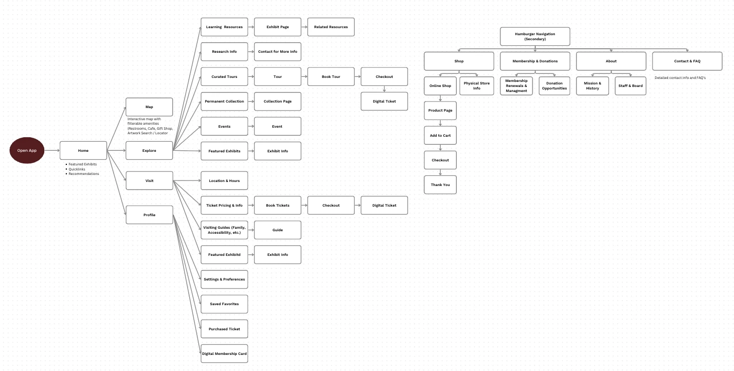
Wireframes & User Flows
Visual Style
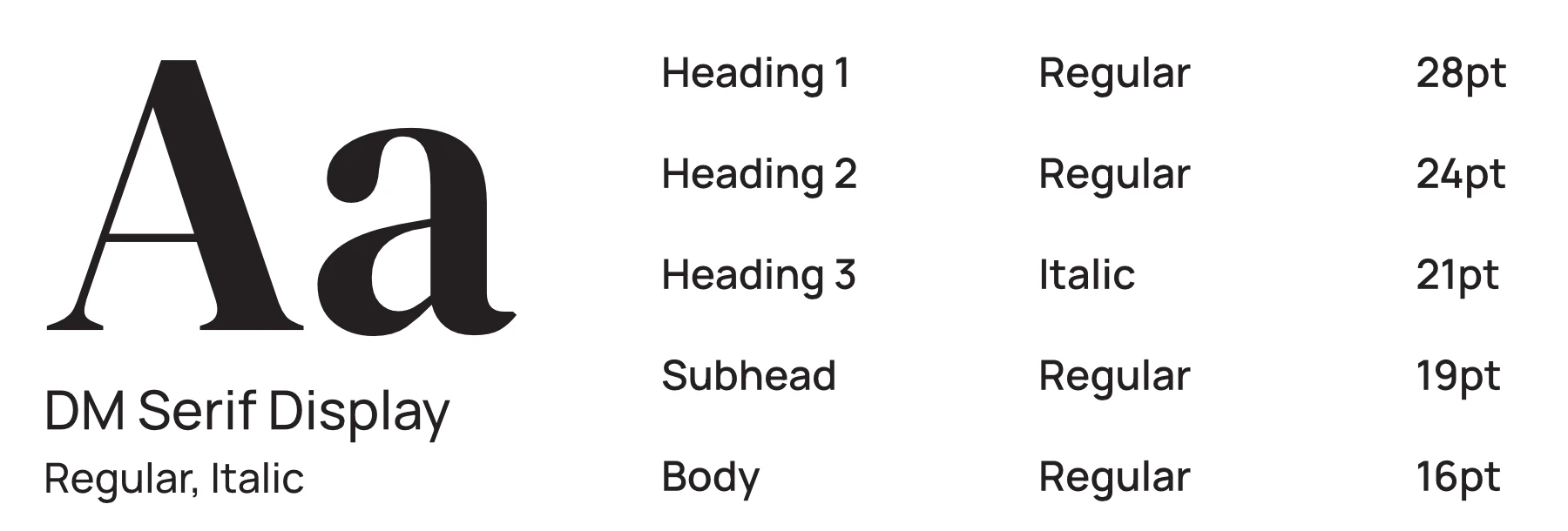
Primary Typography
Secondary Typography

Brand Colors

#F2E3D0

#8B1012

#FFF6EA

#7C7D81

#000000


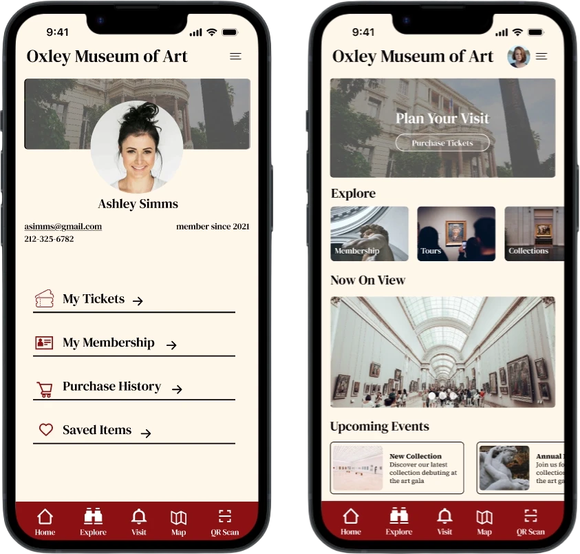
Key Features
Visit Planning Logistics Center
A centralized mobile dashboard that consolidates essential visiting information,including real-time parking, stroller accessibility policies, and sensory-friendly visit times, into a single view.
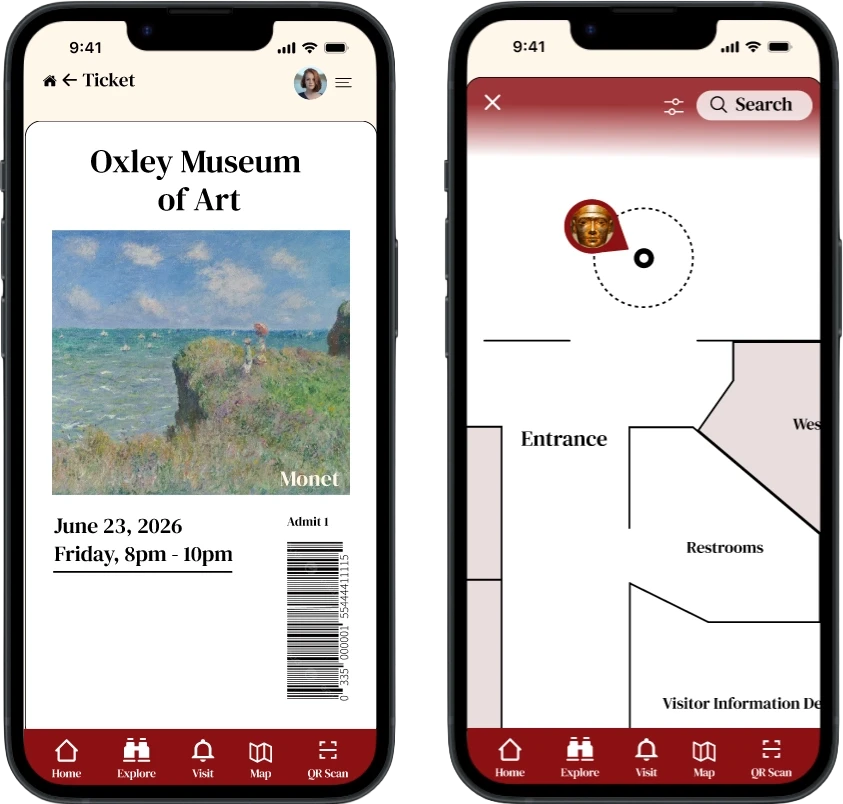
Smart Ticketing & Member Validation
A streamlined, single-flow booking system that automatically recognizes membership status to apply discounts and provides instant QR code access via native mobile wallets.
Contextual "Museum Mode" Map
A location-aware, interactive indoor map that activates upon entry, offering high-contrast wayfinding and filterable points of interest like restrooms, elevators, cafe and exits.
Tiered Content Scanning
An NFC/QR-enabled exploration tool that delivers artwork information tailored to the user’s preferred depth, ranging from kid-friendly summaries to comprehensive scholarly archives.
Digital Collection & "Favorites"
A personal "digital memory" feature that allows visitors to save specific artworks to a private gallery, preserving high-resolution images and artist metadata for post-visit reflection.
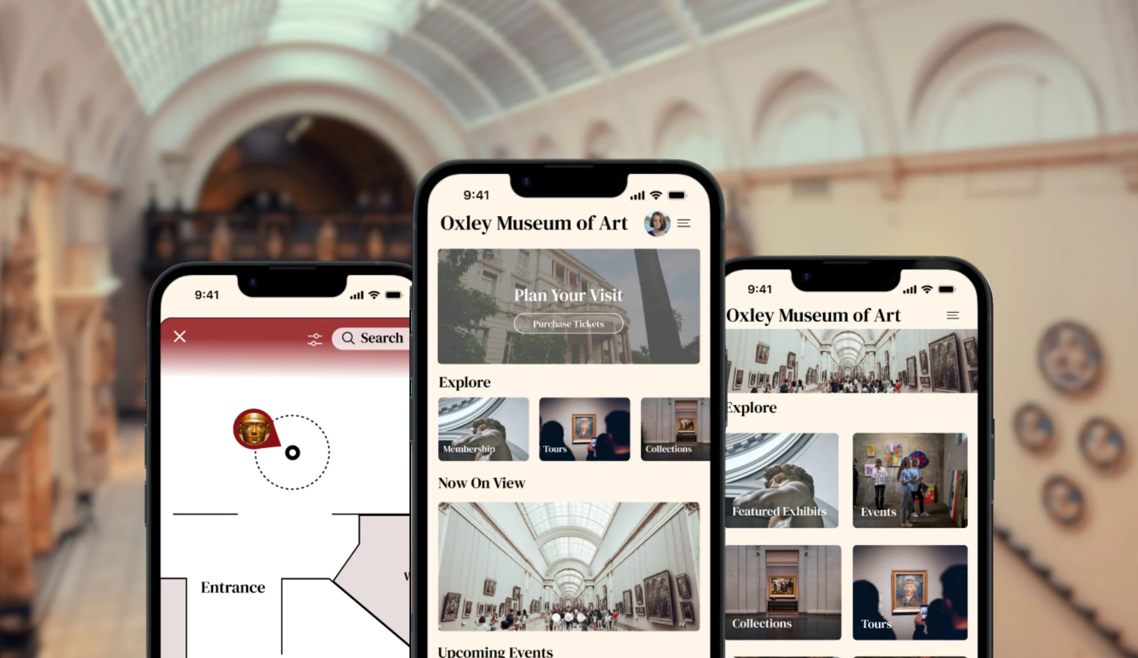
Final Designs & Project Impact
The final designs for the Oxley Museum of Art (OMA) digital experience represent a shift from fragmented information to a cohesive, user-centric ecosystem. By prioritizing accessibility and contextual utility, the final application transforms the museum visit from a logistical challenge into an immersive cultural journey. This project demonstrated that even for a smaller institution like the Oxley Museum of Art, a "one-size-fits-all" digital strategy is ineffective. Through user research and identifying distinct user archetypes, I was able to design a platform that scales its complexity based on the user's intent.